
Works on paper
Drawing, Colour and the Material Life of the Sheet
Across more than three decades, paper provided Janez Pristavec with a space in which observation, analysis, colour, gesture and material experiment could develop with exceptional freedom.
Works on paper occupy a central and remarkably diverse place within Janez Pristavec’s oeuvre. They encompass observational and anatomical studies, autonomous drawing cycles, tempera and acrylic paintings, works in coloured pencil, xerographic processes and combinations of several techniques. Paper was never merely a surface for preparatory sketches. It became an independent pictorial field in which Pristavec could test ideas, develop extended series and create fully resolved works possessing qualities distinct from those of his paintings on canvas.
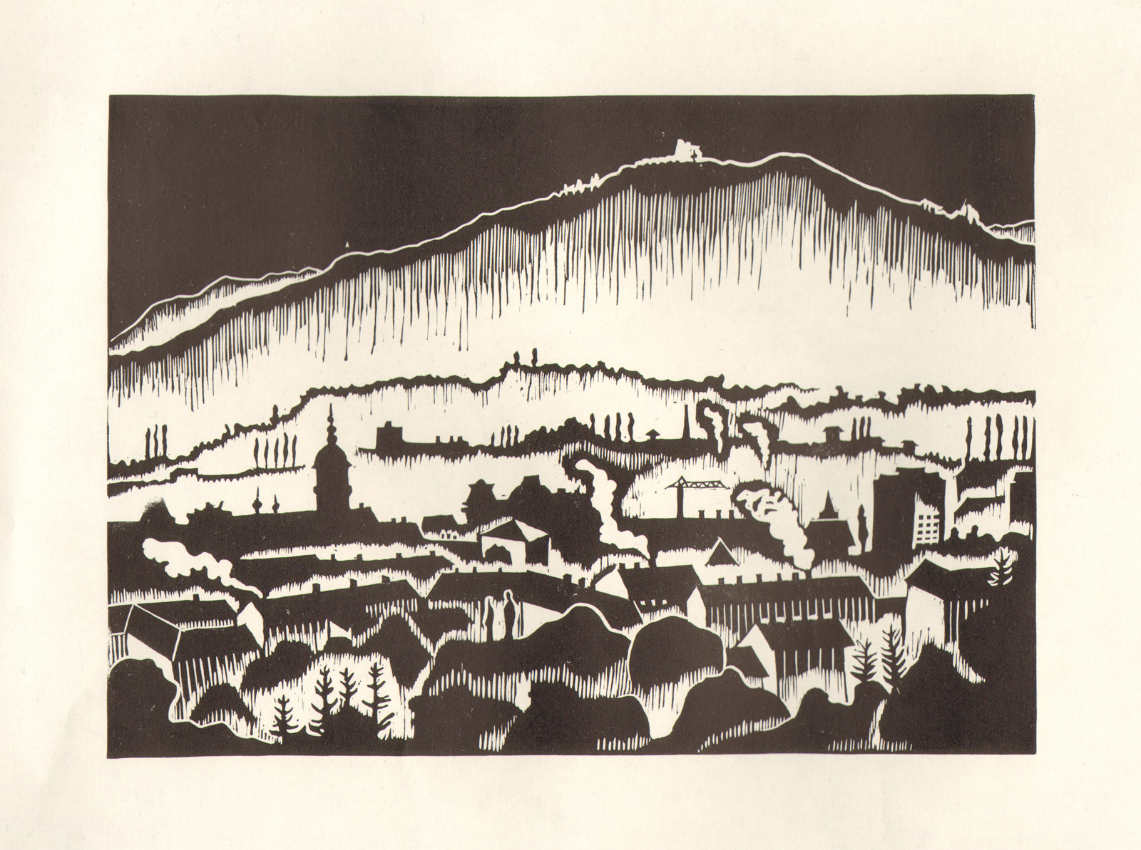
The earliest groups, created during the first half of the 1970s, reveal a disciplined engagement with the visible world. Views of Maribor, rural buildings, winter landscapes and architectural details are constructed through precise relationships of line, tone and empty space. These sheets already demonstrate his sensitivity to the underlying order of a place: the rhythm of windows and fences, the direction of roads and rooflines, and the way buildings are integrated into cultivated terrain.
During his studies at the Academy of Fine Arts in Ljubljana and in the years immediately following them, drawing became an increasingly analytical method. Shells, reptiles, amphibians, skeletal structures and the human pelvis were examined simultaneously as observed forms, anatomical systems and geometric constructions. Coloured axes, stereometric volumes and repeated viewpoints reveal Pristavec’s determination to understand not only the outer appearance of a body, but also the internal relationships that govern its weight, articulation and movement.
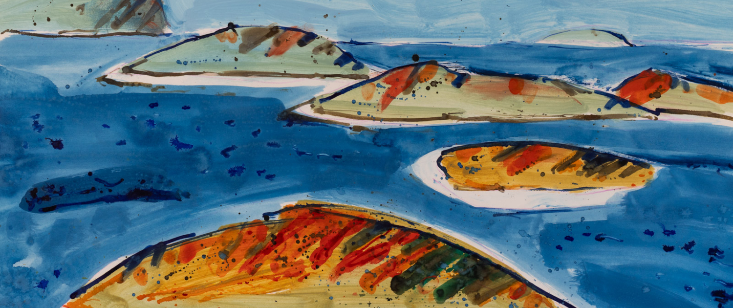
From the late 1970s onward, the distinction between drawing and painting on paper became progressively less stable. In the nudes, figures, still lifes, landscapes and views of Maribor, line is joined by broad areas of tempera or acrylic colour, transparent passages, exposed margins, splashes and drips. The directness of the support allowed observation to be transformed rapidly into chromatic and rhythmic structure. Bodies, objects and places remain recognisable, yet they are increasingly reorganised through contour, deformation and independent fields of colour.
This transformation becomes especially pronounced in the early 1980s with the works known as Množice. Monumental figures and biomorphic formations are compressed into the limited space of the sheet, while repeated bars, shadows and directional structures activate the surrounding field. In other groups, Pristavec folded, crumpled or otherwise physically altered the paper before or during the pictorial process. Creases, relief, reflected light and irregular shadows became active elements of the image, demonstrating that the sheet itself could participate in the construction of the work.
Throughout the 1980s and 1990s, paper remained a particularly open territory for serial exploration. Figures, portraits, animals, still lifes and landscapes appear in related variations through which Pristavec tested changing relationships between observation and invention. The animal drawings and Tuataromahija compositions transform anatomy into a field of movement, confrontation and hybridisation. In the Minotaur Cycle, the mythological creature becomes a vulnerable physical presence whose wounded, resting, sleeping and lifeless body is shaped through accumulated contours, dense hatching and areas of untouched paper.
Pristavec’s use of mixed and reproductive techniques further expanded the possibilities of the medium. Xerographic transfer could compress or repeat an existing image, after which drawing and colour re-entered the surface as new interventions. Such procedures blurred the boundary between original and reproduction, while allowing a single motif to pass through several material and visual states.
The abstract cycle Asociacije, created in 2000 and 2001, represents another distinctive approach to the sheet. Repeated strokes of coloured pencil form horizontal bands, diagonal fields, segmented axes and dense networks of pointed or leaf-like units. Colour is not applied to a previously established drawing; it is generated through the physical accumulation of drawn marks. A limited set of visual rules produces continual variation in rhythm, direction, density and chromatic balance.
Seen together, these works reveal paper as Pristavec’s most adaptable creative territory. It could serve as a place of close observation, anatomical analysis, rapid painterly response, physical intervention, mechanical transformation or sustained serial research. The continuity between the different groups lies not in a single style or technique, but in a persistent method: Pristavec observes a form, uncovers its internal structure and reconstructs it through line, colour, surface and gesture.
The galleries gathered here trace this process from the early architectural and landscape studies to the academy sheets, painted figures and objects, experimental cycles, hybrid bodies and late abstractions. Together, they demonstrate that Pristavec’s works on paper are not secondary to his paintings on canvas. They constitute an extensive and autonomous body of work in which some of his most searching formal and material investigations took place.