

Still Life on paper
Objects, Flowers and Serial Variation, 1967–2007
Across four decades, familiar objects became a testing ground in which Pristavec repeatedly reworked the relationships between observation, colour, repetition and pictorial structure.


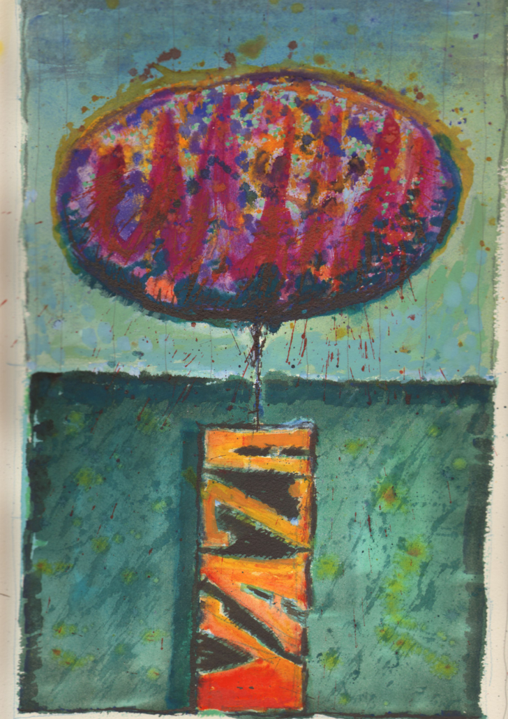
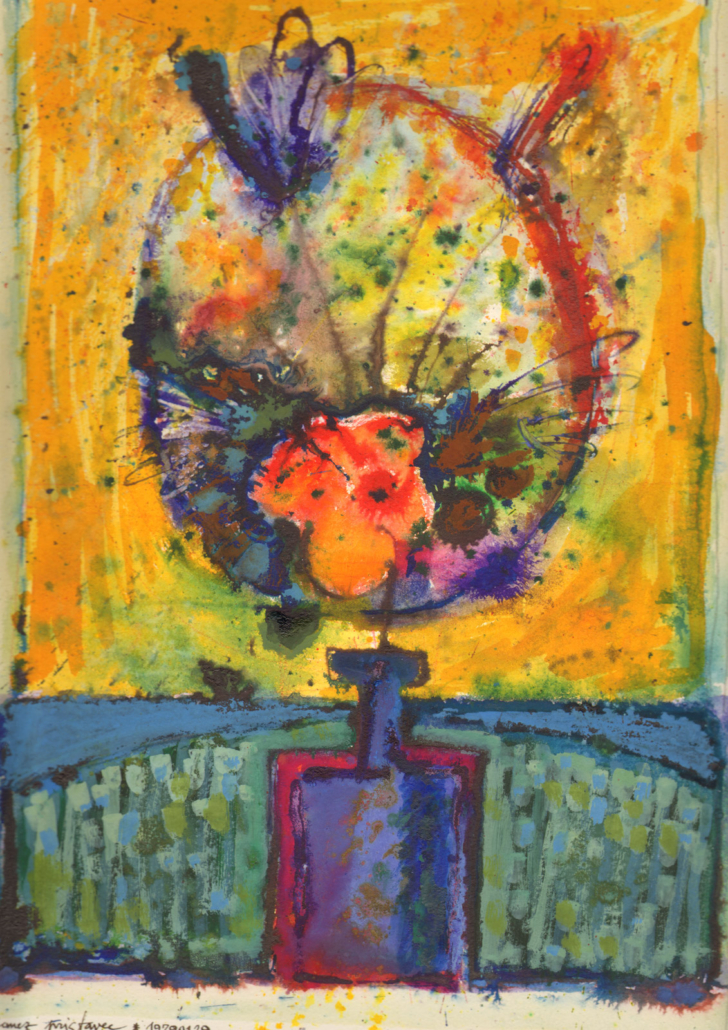
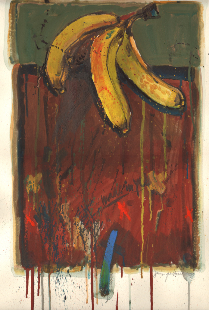

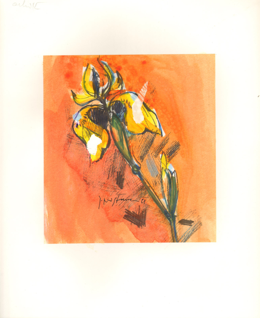
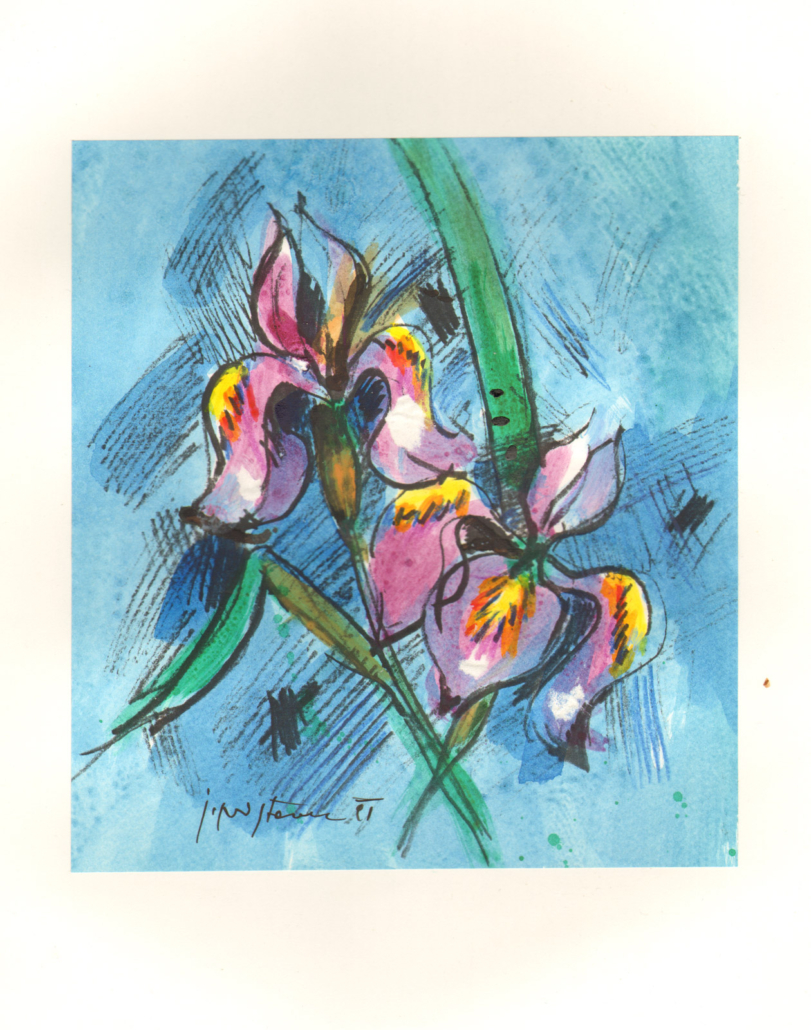
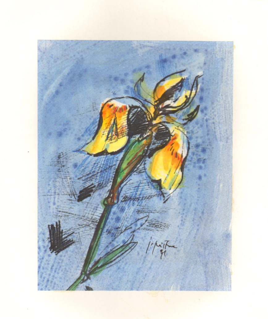
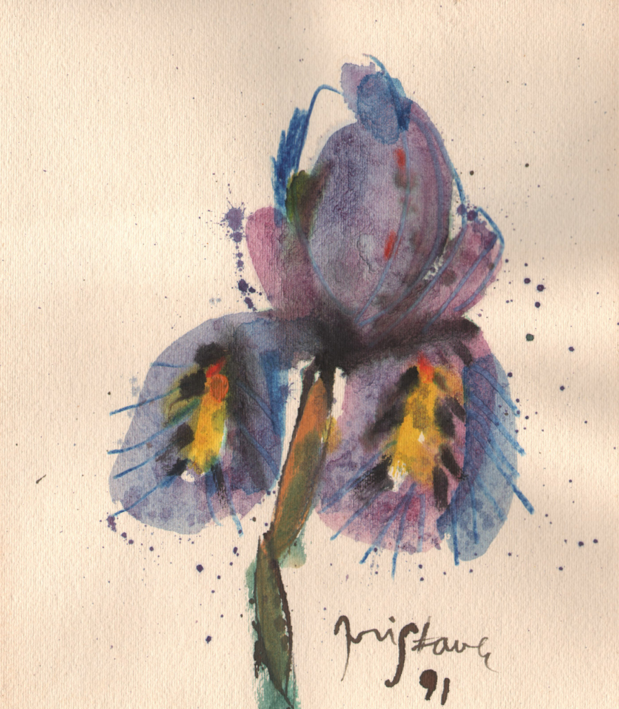
Janez Pristavec’s still lifes on paper encompass drawings, watercolours, temperas, mixed-media works and monotypes created between 1967 and 2007. They do not form a single continuous cycle. Instead, leaves, fruit, flowers and vessels reappear at different moments, allowing the artist to approach familiar subjects through changing techniques and pictorial languages.
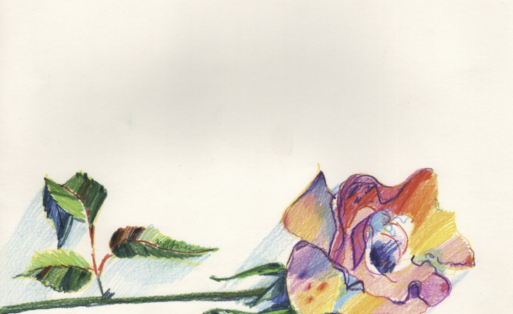
The earliest works remain closely connected with observation. A single autumn leaf, a potted plant or a piece of fruit is isolated against a broadly treated background and examined through contour, texture and colour. Even in these formative sheets, however, the object is not merely recorded. Its placement, scale and relationship to the surrounding field are carefully constructed.
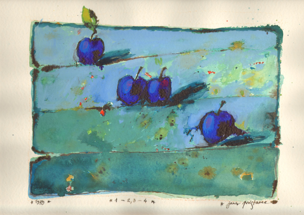
During the late 1970s and 1980s, still life becomes increasingly integrated into the organisation of the entire surface. Fruit is enlarged or distributed across horizontal bands, while flowers appear in both traditional vessels and improvised containers. The Mirinda and Coca-Cola cans introduce ready-made lettering and saturated commercial colour into the still-life tradition, creating a striking contrast between the regular geometry of the container and the irregular growth of the plant.
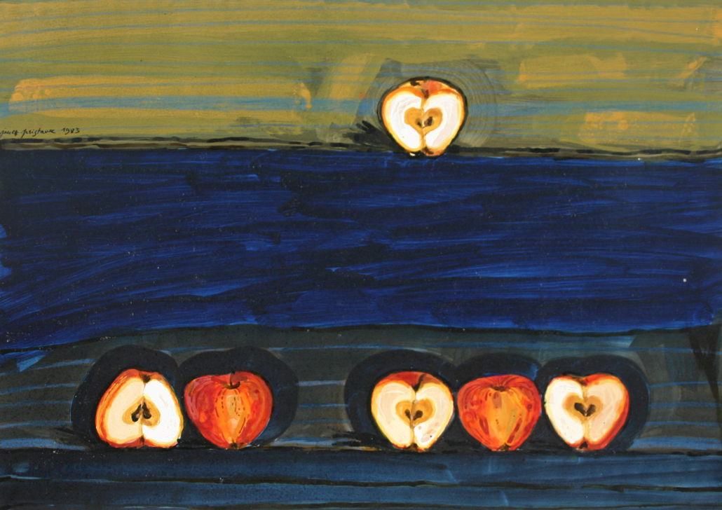
Repetition becomes especially important in the mixed-media apple compositions of 1983. Halved apples are arranged in rows and small groups against layered chromatic fields. Each version changes their number, spacing and relative position. The repeated object therefore functions as a pictorial unit through which Pristavec investigates order, difference and visual rhythm.
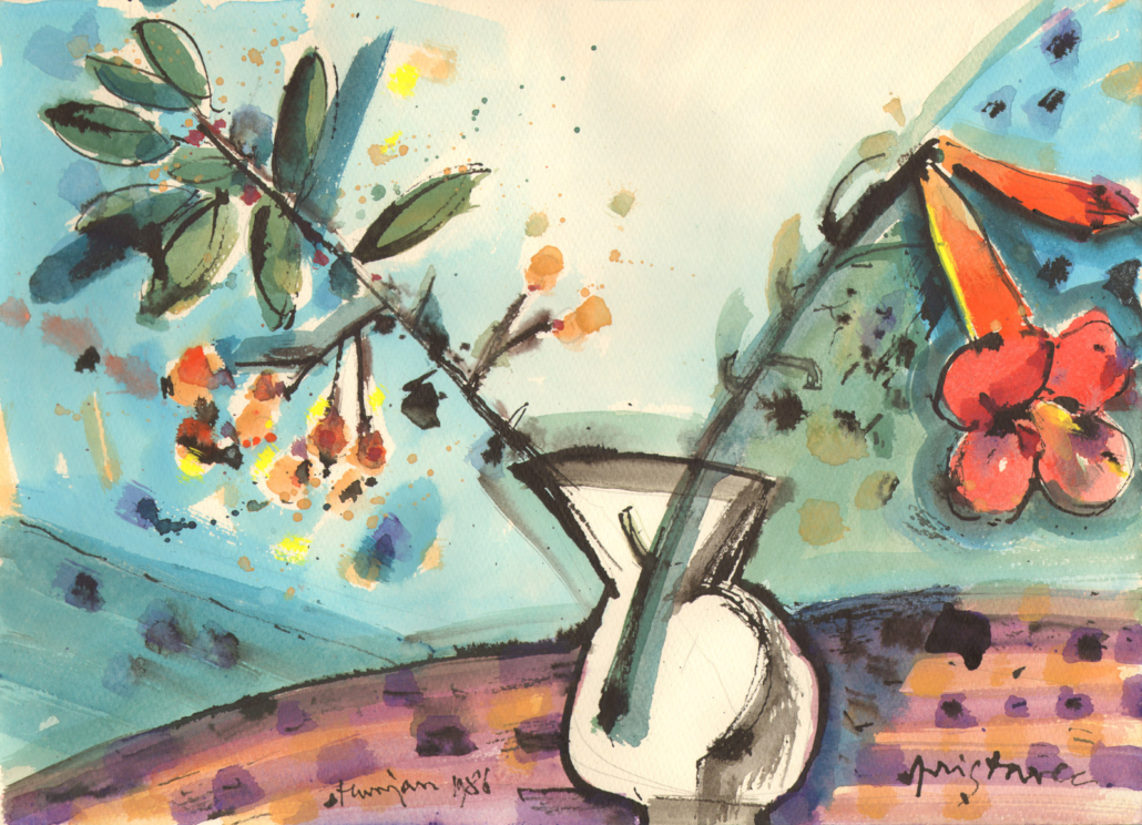
The temperas of the mid-1980s restore the vessel as a stable compositional centre, while branches, leaves and blossoms spread asymmetrically across the surrounding field. In the linocut monotypes of 1990, transferred textures and painterly intervention produce a denser surface. Dark outlines, blue-green grounds and concentrated yellow flower heads allow the botanical motif to remain recognisable while becoming part of a larger network of colour and graphic marks.
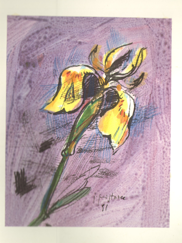
The works from 1991 and 1992 increasingly concentrate on a single flower. Its scale, orientation and position change from sheet to sheet, while violet, orange and blue backgrounds transform its emotional and spatial character. The flower becomes an isolated pictorial sign and, at the same time, the basis of a serial investigation.
Pristavec returned to this method in 2005, repeatedly placing an iris-like flower within or across a hand-drawn rectangular field. The works from 2006 again introduce a flower-filled vessel; several carry notes identifying them as designs for a lithograph. These inscriptions reveal the artist considering how the vitality of drawing and colour might be translated into print.
In the drawing of 2007, the familiar bouquet is reorganised through intersecting contours and angular colour planes. Flower, vessel and background remain partly legible, yet increasingly participate in the same geometric structure. The work does not mark a simple conclusion in a linear development. Rather, it demonstrates how observation, stylisation and abstraction continued to coexist within Pristavec’s practice.
Still life was therefore never merely a conventional genre for Pristavec. Its limited vocabulary of objects provided a remarkably flexible structure through which he could examine colour, line, repetition, surface and pictorial space across several decades.